What a 4.5:1 contrast ratio actually means
WCAG 2.1 requires a 4.5:1 contrast ratio for normal text (under 18pt) at Level AA — the legal standard in the US, EU, and UK for public-facing websites. The ratio is calculated from the relative luminance of each color, where pure white is 1.0 and pure black is 0. The formula weights the R, G, and B channels non-linearly to approximate how human vision perceives brightness differences. Full explanation with worked examples here.
In practice: black text (#000) on white (#fff) is 21:1 — the maximum. The popular "gray on white" pattern ("#767676 on #ffffff") is exactly 4.54:1 — just barely passing. One step lighter, #777, drops to 4.48:1 and fails. This is the zone where most accessibility violations live in production: designers choose gray text for visual hierarchy, then pick a shade that's two hex values too light.
The patterns that fail most often
| Pattern | Typical ratio | Pass/Fail AA | Fix |
|---|---|---|---|
| Placeholder text (#9CA3AF on white) | 2.4:1 | FAIL | Use #6B7280 or darker |
| Secondary text (#6B7280 on white) | 4.6:1 | PASS (barely) | Avoid on off-white backgrounds |
| Disabled button (#9CA3AF on #F3F4F6) | 2.0:1 | FAIL | WCAG exempts disabled elements |
| White on brand blue (#3B82F6) | 3.0:1 | FAIL | Darken to #1D4ED8 for white text |
| White on green (#22C55E) | 2.3:1 | FAIL | Use dark text or darken to #15803D |
| Yellow text on white | 1.1–1.8:1 | FAIL | Yellow is near-invisible on white |
What automated checkers can't catch
This checker evaluates flat color pairs. It cannot check text on gradient backgrounds, text over images, or text where color changes on hover/focus. For gradients, check both the lightest and darkest points of the gradient against your text color and use the lower (worse) ratio as your reference. For images, the 1:1 rule of thumb: if the background contains a range of tones, a semi-transparent dark overlay behind the text is usually more reliable than trying to find a single text color that passes everywhere.
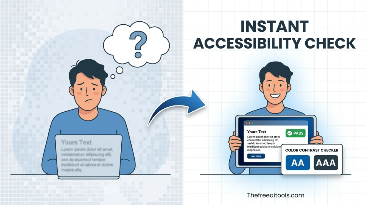
WCAG AA-passing color combinations — ready to use
WCAG 2.1 Level AA requires a contrast ratio of at least 4.5:1 for normal text and 3:1 for large text (18pt+) and UI components. These combinations all pass:
| Text color | Background | Contrast ratio | Use case |
|---|---|---|---|
| #000000 (Black) | #FFFFFF (White) | 21:1 ✓ AAA | Body text, high-readability documents |
| #FFFFFF (White) | #000000 (Black) | 21:1 ✓ AAA | Dark mode body text |
| #1A1A2E (Dark navy) | #FFFFFF (White) | 16.1:1 ✓ AAA | Heading text on white backgrounds |
| #FFFFFF (White) | #0057B8 (Blue) | 5.1:1 ✓ AA | Primary CTA buttons |
| #FFFFFF (White) | #2E7D32 (Green) | 5.1:1 ✓ AA | Success state buttons |
| #FFFFFF (White) | #B71C1C (Dark red) | 5.9:1 ✓ AA | Error/danger buttons |
| #212121 (Near black) | #F5F5F5 (Light grey) | 15.3:1 ✓ AAA | Card content on light backgrounds |
| #1B5E20 (Dark green) | #E8F5E9 (Light green) | 7.2:1 ✓ AAA | Success alerts / banners |
| #B71C1C (Dark red) | #FFEBEE (Light red) | 5.8:1 ✓ AA | Error alerts / banners |
| #FFFFFF (White) | #333333 (Dark grey) | 12.6:1 ✓ AAA | Dark headers, nav bars |
Paste any pair above into the checker to see the live preview and confirm the ratio for your specific context. Note: these ratios apply to text only — icons and non-text UI components need a 3:1 ratio (WCAG 1.4.11 Non-text Contrast).